NormalizeData
Numerical data plotted as series of plots and images, often needs to be normalized prior to plotting.
In matplotlib module, this can be achieved by adding linear and logarithmic norms to images.
The norms require calculations of minimum and maximum values of the plotted data.
Class NormalizeData offers a quick and concise way to extract these values from each data part and to calculate total normalization constrains for a final figure.
The script below gives an example how to calculate linear and logarithmic norms from a simple list.
>>> from scinumtools import NormalizeData
>>>
>>> xlen = 10
>>> ylen = 20
>>> data = np.linspace(1,xlen*ylen,xlen*ylen).reshape(xlen,ylen) - 10
>>>
>>> with NormalizeData() as n:
>>>     for row in data:
>>>         n.append(row)
>>>     linnorm = n.linnorm()
>>>     linnorm.vmin, linnorm.vmax
(-9.0, 190.0)
>>>     n.lognorm()
<matplotlib.colors.LogNorm at 0x1275e4410>
>>>     n.zranges()
Ranges(minpos=1.0, min=-9.0, max=190.0)
Data domains (axis) can also vary from plot to plot. Extents of x, and y axes are calculated in a following example.
>>> with NormalizeData(xaxis=True, yaxis=True) as n:
>>>     for r,row in enumerate(data):
>>>         xdata = np.linspace(-r,r,xlen)
>>>         ydata = np.linspace(-r*2,r*2,ylen)
>>>         n.append(row, xdata, ydata)
>>>     n.xranges()
Ranges(minpos=0.11111111111111116, min=-9.0, max=9.0)
>>>     n.yranges()
Ranges(minpos=0.10526315789473673, min=-18.0, max=18.0)
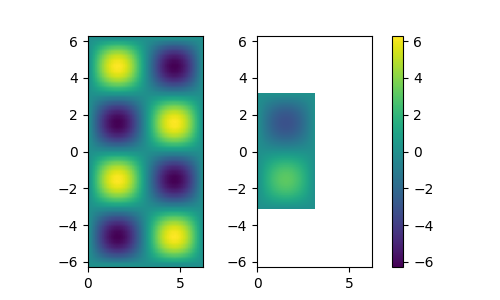
In the example below we, calulate norms from two sets of image data and plot them using normalized color in matplotlib.
>>> from scinumtools import NormalizeData
>>> import matplotlib.pyplot as plt
>>> import numpy as np
>>>
>>> with NormalizeData(xaxis='lin', yaxis='lin') as nd:
>>>
>>>     for size in [np.pi*2, np.pi]:
>>>         xaxis = np.linspace(0,size,50)
>>>         yaxis = np.linspace(-size,size,50)
>>>         zdata = size*np.vectorize(lambda x,y: np.sin(x)*np.sin(y))(*np.meshgrid(xaxis,yaxis))
>>>         nd.append(zdata, xaxis, yaxis)
>>>
>>>     xranges = nd.xranges()
>>>     yranges = nd.yranges()
>>>     norm = nd.linnorm()
>>>
>>>     fig, axes = plt.subplots(1,2,figsize=(5,3))
>>>
>>>     for i, (data, extent) in enumerate(nd.items()):
>>>         ax = axes[i]
>>>         im = ax.imshow(data, extent=extent, norm=norm)
>>>         ax.set_xlim(xranges.min, xranges.max)
>>>         ax.set_ylim(yranges.min, yranges.max)
>>>
>>> fig.colorbar(im, ax=axes.ravel().tolist())
>>> plt.show()
Notice that each plot has diferent x/y axes and different z data value ranges.
NormalizeData class automatically calculates individual data extents, as well as common value ranges of axes and data.